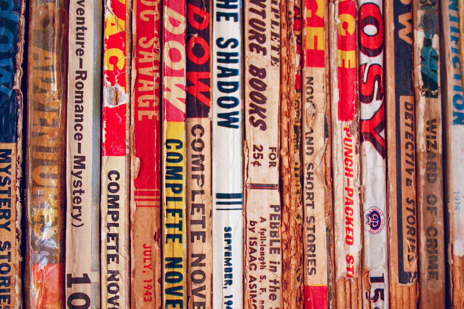
As you’ve noticed, if you’re a regular visitor to ThePulp.Net, we’ve tweaked our design only slightly over the years, but never varied too much from its basic structure.

That structure was created at a time when Web browsing and Web browsers were relatively new, and complex designs often resulted in sluggish browsing or unreadable pages.
In our 10th year online, we’re wondering if it’s time to rethink TPN’s look and organization. Whatever we do, we’ll follow a mantra from the newspaper biz, “Information, Not Decoration.” We won’t sacrifice the reason you visit TPN for flash and glitz.
In the least, we will be reworking the underlying code for TPN to bring it up-to-date with CSS and such.
Is simpler, better? Or, would a bit of pizzazz be a good thing? What are your thoughts?
– William


